October 7th ~ 10th
This was a productive week, filled with exciting graphic tasks. Reflecting on some of the key events this week ★
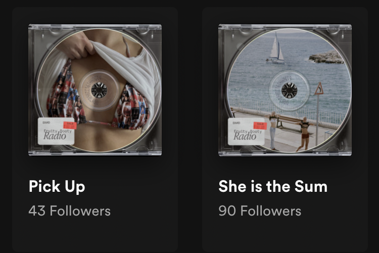
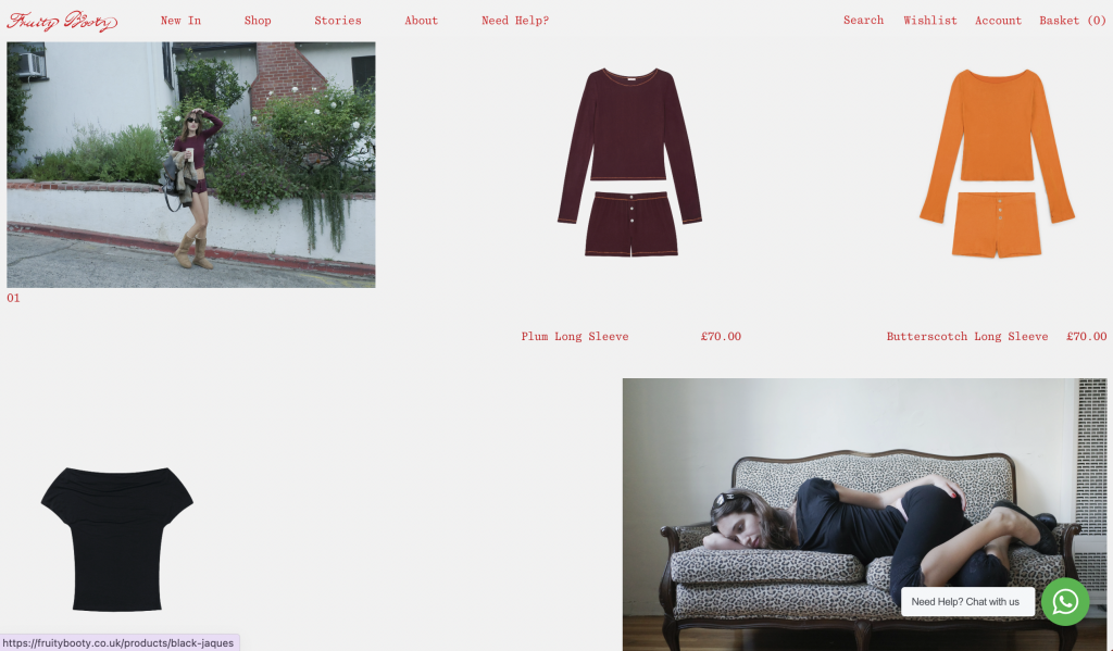
< Spotify album cover >
The task was to replace the images for the Spotify playlist cover that had been removed. (because the image was too explicit?) It was a rather simple task, but it was my first official? public? graphic task which made me excited to see the final product – which I was quite satisfied with. I selected various images from different collections that I thought embodied Fruity Booty’s branding concept, something sexy but adorable and fun. I found how Fruity Booty has a playlist that corresponds to their collections intriguing from a marketing and branding perspective: I didn’t know brands do this!
↓Below are some of the covers I have created
< Going on a hunt for SS25 charms >
I was given a task to go around fabric suppliers to look for vintage charms that could be used for one of the pieces from the SS25 collection. I had to consider its quantity, timing of supply, pricing, invoice, etc which made me realise that I’m actually working for a real brand… Talking to the suppliers and discussing these specifics made me feel like a working adult? which felt strange (because I feel like I’m not ready to be one) but exciting. However, eventually, I couldn’t find any charms which made me a little upset as I was unable to show them what they wanted. This experience made me wonder how difficult it must be to find the material that both matches their needs and is sustainable.
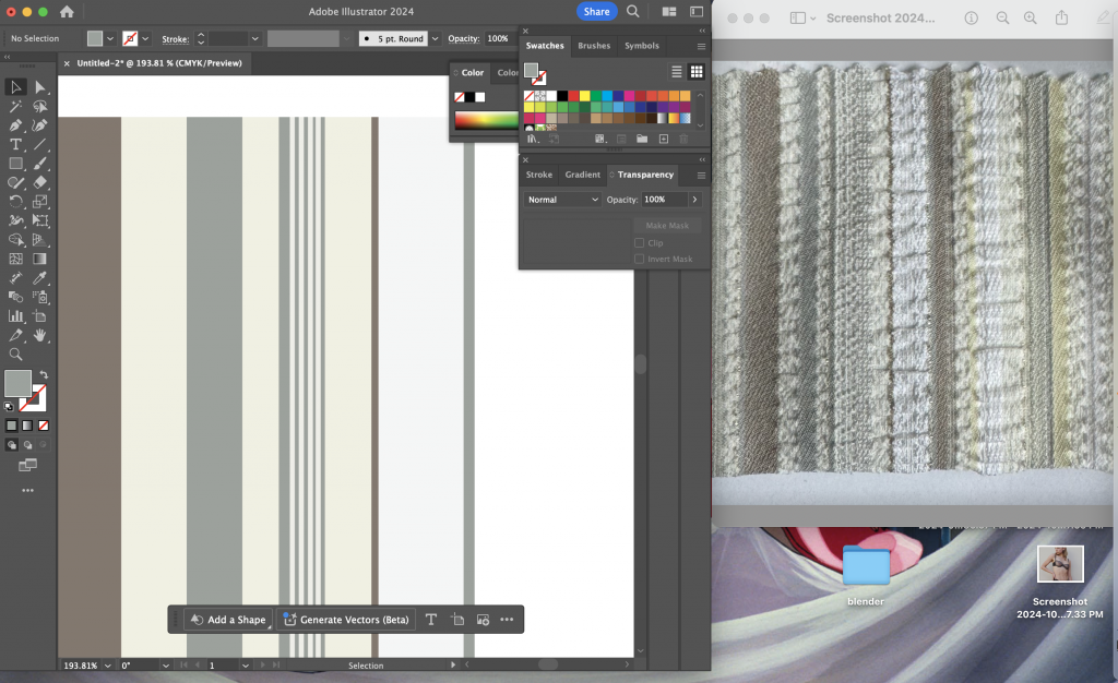
< Creating fabric swatch >
I was helping the designer create a pattern swatch of fabrics that are required when digitalising it into CAD. I discovered that I enjoy doing these simple tasks that may help everyone work smoothly and I was pleased that my contribution was helpful.
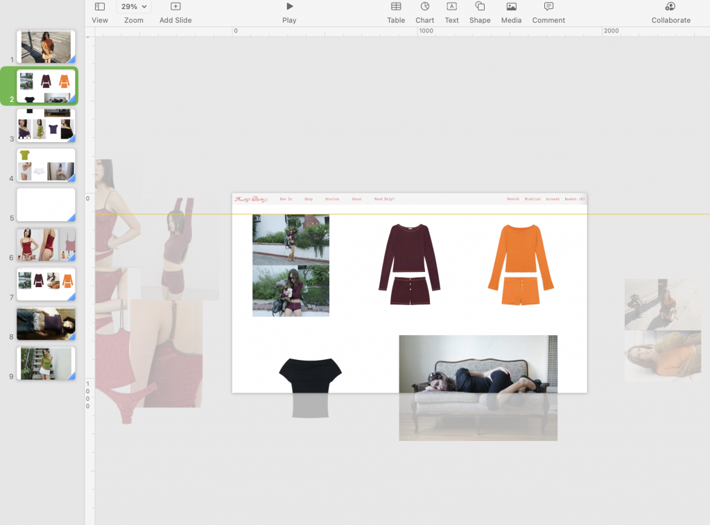
< Website mockup >
On the launch day for one of the collections I was asked to create a website mockup: selecting the images for the hero page and experimenting with the front page layout. I had to consider the balance between campaign photoshoot images, e-com images, and the flat lay of the products. Because all the images were strong and incredible, it was not easy to select the images, especially the hero image. To make them more realistic, I animated the assets.
Quote from my journal:
“I was very happy about this, although I haven’t done it before, I could use and showcase my composition/layout skill, which I believe they thought the same too –> wanted to see how I create the composition? This allowed me to touch base on what happens on the launch day and how the webpage is designed. However since what I created was only the mockup done on Keynote, I’d like to learn the real process of web design which I assume is less flexible than Keynote. This is something to take into account when creating another one in the future if the opportunity is given.”
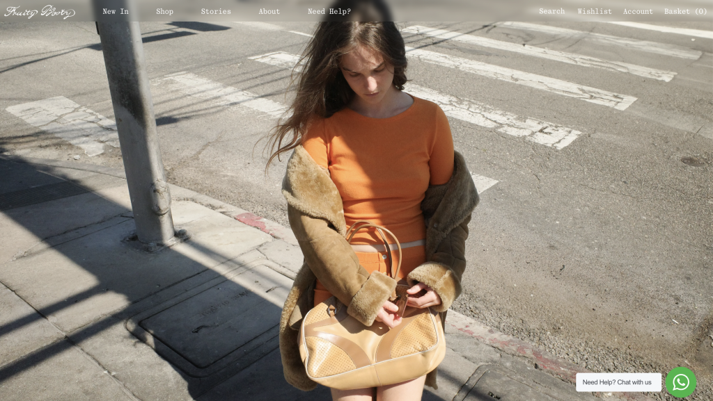
Through discussions with the creative director, I was able to finalise the layout.
Quote from my journal: “I had a great sense of accomplishment when I saw the finished product, which I was proud of. It may not be the most impressive thing, but I think this experience and emotion is crucial to me through this journey –> a sensation I should not forget. Seeing my design come to life and showcased in a public context fascinates me every time! A hero page is essential for a web page, so I was grateful to take on this role. I was not expecting the mock-up to be fully published on the website, but I was very pleased and even more motivated to contribute to the brand and create content that will be loved by lots of people.”
Leave a Reply